Castle On Lydell: Powder Room Transformation

A common theme while designing the Castle is decisiveness. I had a clear vision of what I wanted for each and every room. It’s hard to explain it. I knew I wanted the original character of the home to shine through. And, it’s almost like each room spoke to me and told me how it should look. I mean, no sane person would immediately think to paint a ceiling black, right? The mudroom and powder room were no different.
I love decorating bathrooms. They’re a small space where it’s easy to make a big statement. As soon as I saw the two toned paint in the powder room I knew what was in store for this itsy bitsy room. I probably say this about every space in the Castle, but this is my favorite room. The transformation is so large here that it really makes me smile. I would have to say this is the most “Olivia” room in the entire house. It’s dramatic, it’s fun, it’s luxe, and it’s completely unexpected. Without further ado, ladies and gentlemen, the transformation of the mudroom & powder room.
The Before
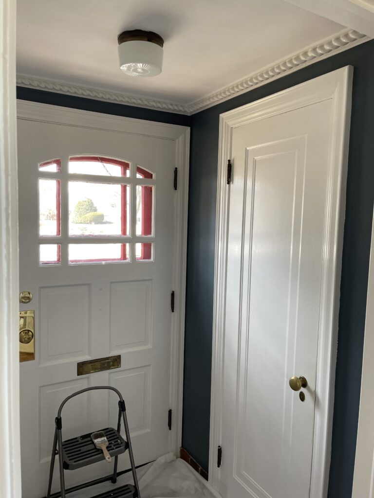
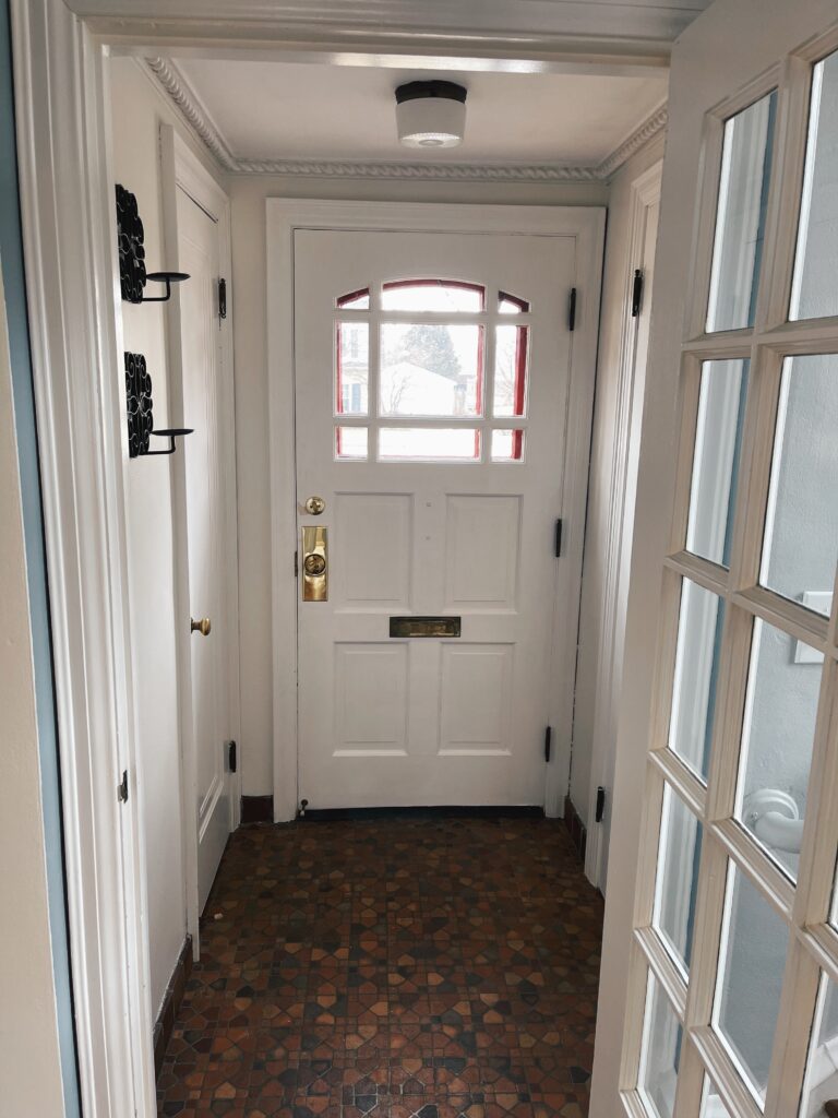
Like the rest of the house, the mudroom had gorgeous original crown molding, an original light fixture, and beautiful floors. But, all of that original character was being hidden by a dark and dreary paint color. This is a small space with little to no natural light, despite it having the front door. The dark grey blue that was in here made the space feel even smaller & colder. The cool tones in the paint didn’t go with the warm terracotta tones of the brick pavers. The thing that’s great about small spaces is that they’re a quick project. This room took me 1 day to prime and add 2 coats of paint. Easy peasy.
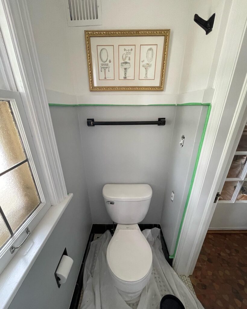
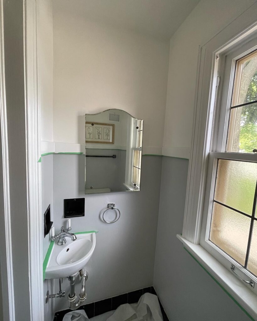
To me the powder room was the easiest room to bring personality to. The black and white tile floors really steered my design decisions. Grey and white two toned walls was probably the most bland decision that could’ve been made in here. Again, it felt cold and sterile. It lacked a point of view. This tiny room did not take me 1 day to complete. In fact, this room terrorized me for days after the transformation. Pro tip: don’t use peel and stick wallpaper in a 3’ by 4’ room. The wallpapering job really took blood, sweat and tears to complete. Was it worth it? 100%.
The After
The mudroom was easy. She just needed to lighten up. So, I took my trusty Benjamin Moore White Dove to the walls. In under 24 hours she went from closed off and uninviting, to bright and cheery. It’s not like I spend a ton of time in the mudroom, but it’s so nice looking through the glass door and seeing the continuance of warm white tones.
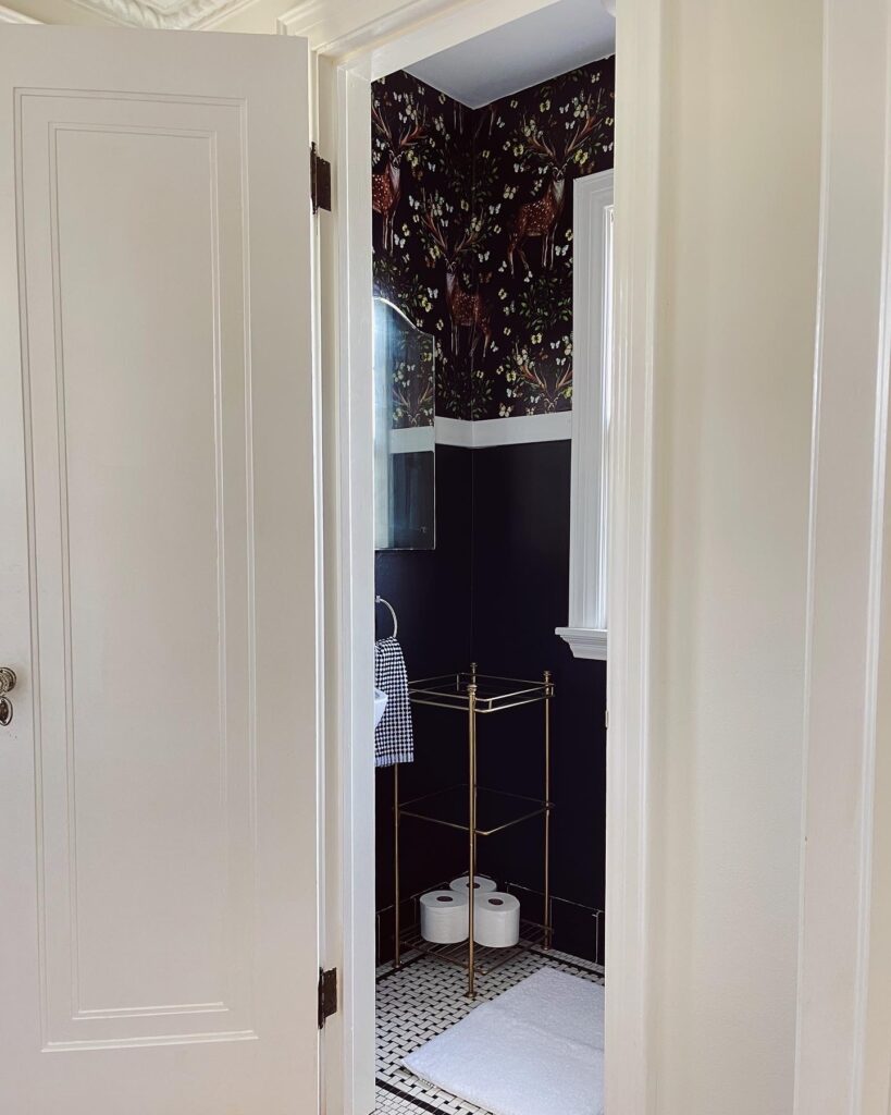
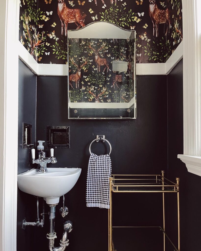
The powder room took courage. I knew my vision was sound. I used Behr Carbon Black in a satin finish to match the fireplace & dining room ceiling. Satin is a better finish option in bathrooms and kitchens because it’s easily wiped down. Painting was challenging just because there were pipes and appliances to get around. After the first coat I had a “oh shit” moment. But, the second coat of paint made any streaks or blemishes disappear. I could’ve left the bottom half black and the top half white and been happy. It had contrast and matched the floors. But, I had already bought the wallpaper. And so the application began.
The first time I applied the wallpaper I threw temper tantrums because it was so challenging. Disclaimer, this was my first time EVER using peel and stick, or wallpapering at all. I think if I used this paper in a bigger space, or if I had chosen a design that didn’t have such precise repetition the application would’ve been easier. By the time I was ⅔ done, I was out of paper.
I was frustrated because I was already in a bad mood. I didn’t want to have to go through this horrible experience and ruin another day. But alas, I had no choice.
The second time I applied the peel and stick was definitely better. I knew what to expect and cleared my entire afternoon. I put on happy music and told myself “it’s just wallpaper. There’s no need to get angry.” I stayed relatively calm. 3 sheets of paper took me 2.5 hours. But it got done and I’ve never felt so relieved.
The Details
I shopped around for ages for the perfect wallpaper. I originally thought I would go with something floral. But, when I saw this deer and butterfly motif I was in love. I can’t imagine using a different paper. My gold stand was $15 on Facebook Marketplace. I originally bought this when I lived in my apartment as a nightstand. A coat of gold spray paint was all she needed to look elevated. I’ve kept her ever since, and I love how perfectly she fits in our itty bitty bathroom. I kept my styling minimal: just a little faux greenery and some deer antlers. Antlers aren’t just for hunting cabins up north!
These 2 spaces were so fun to elevate. I love how they tie in with the rest of the house, while the powder room is still different enough to stand out. Keep in mind that small spaces have the ability to make the biggest impact. Follow @castleonlydell for more home content and @oliviajoehl for behind the scenes content.
