Castle On Lydell: Kitchen Transformation
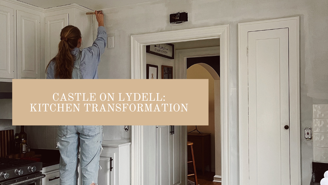
Ah, the heart of the home. A good kitchen can make or break a home, and I’m sure we’ve all seen it happen on House Hunters. The home really centers around a kitchen. After all, it’s where we cook nourishing meals for our loved ones. It’s where people congregate when they visit. For me, it’s a place where I unleash my creativity.
Luckily, when we moved in, the kitchen had been recently updated. We have new stainless steel appliances, trendy floor tiles, and freshly painted cabinets. The updates we wanted to make were minimal, but wow did they make a big impact. I was either going in 2 directions with this room: bright and white, or dramatic and black. I initially thought that black would make a statement and tie into the black dining room ceiling and other accents in the home. But, after my mom and I painted the foyer black I knew it would be too much.
The Before
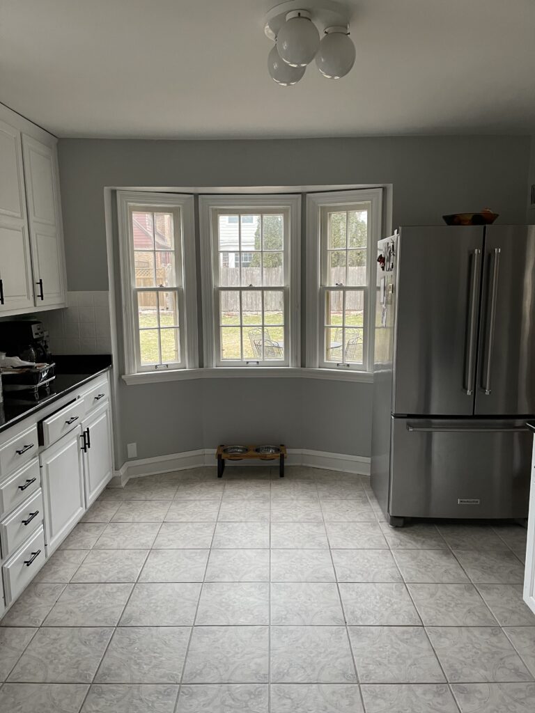
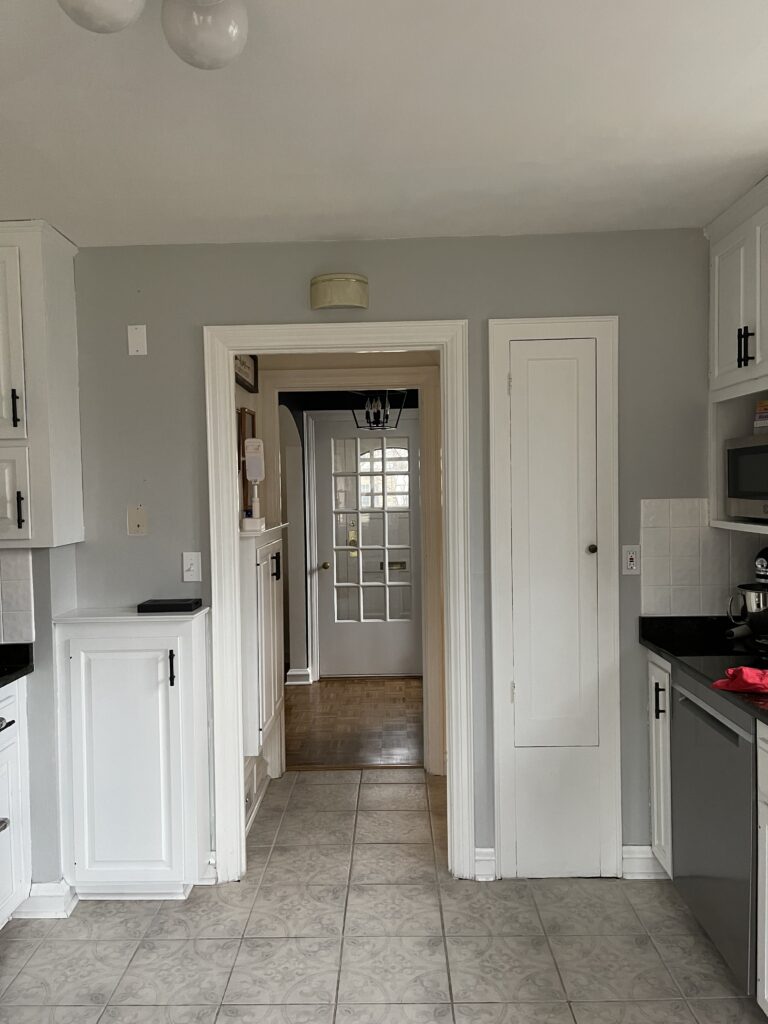
I bet you’ll never guess what color our kitchen was. That’s sarcasm, by the way. It was grey. Luckily it was a light kiss of grey, nothing as dark as the living room or foyer. But, grey nonetheless. It matched the motif on the floor tiles and really didn’t look bad, which put it low on my priority list. I survived over a year with a grey kitchen! I deserve an award. Once the days started getting shorter and it was dark outside all the time, I was craving some brightness in this space. After the rush of the holiday’s I was ready to nest a little and create a more inspiring kitchen.
The After
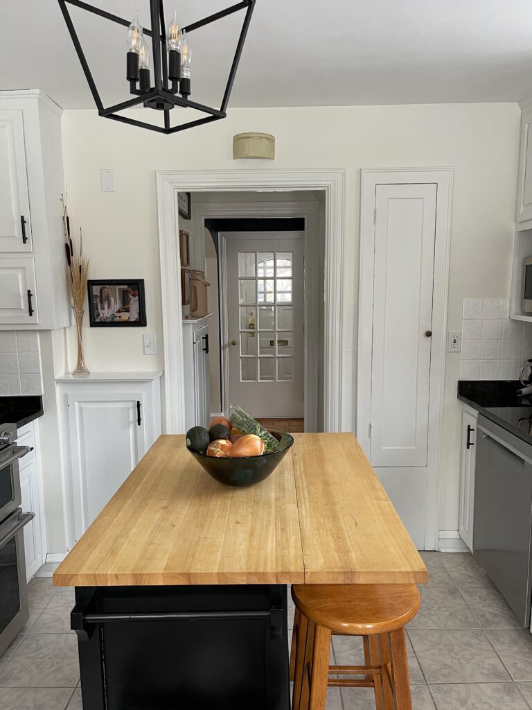
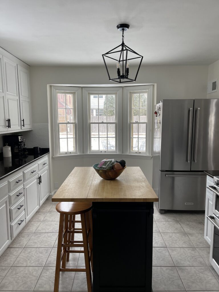
Like I said, not a lot changed. The cabinets, hardware and floor all stayed the same. But, I went in with my trusty Benjamin Moore White Dove and lightened up the walls. I even gave the ceiling a fresh coat of white paint. If you ever want to target the itty bitty muscles you didn’t know you had, I highly recommend painting your ceiling. It’s a great workout. I really didn’t realize how dark the kitchen felt until I painted it white. You can feel the light reflecting off of the walls and it feels amazing.
The one other change we made was the light fixture. We replaced our triple bulb fixture for the lantern originally hung in our foyer. You see, if the lantern wasn’t in the most perfect position, the door from the entryway to the foyer would hit it. I’m not sure who originally measured for this, but they didn’t do a great job. Now the black lantern ties in perfectly with our black countertops, cabinet hardware, and the rest of the first floor. We added a classic schoolhouse light in the foyer that really matches the original era of the home. It still feels fresh and modern with a black base, but it’s a style that will stand the test of time.
And with that, the first floor of the Castle is complete and cohesive. I couldn’t have tackled these projects without Scott supporting my vision and helping with the heavy lifting, or without my mom for teaching me everything I know. Now, I move onto the basement, which desperately needs a glow up, and the upstairs stairwell that is going to get a big wash of White Dove. Stay tuned for more Castle updates, and follow me on Instagram for behind the scenes & real time updates.
